Let me say something that’s going to sting a little: most Amazon influencers are doing their thumbnails completely wrong. Not slightly wrong — backwards. Your custom thumbnail is one of only two tools you genuinely control to win clicks in the Amazon Influencer carousel, and if you’re letting Amazon auto-pick it, or you’re cluttering it with text and arrows, you’re handing away commissions. In this post I’m breaking down what a great shoppable video thumbnail actually looks like, using real examples from my own storefront.
Why Custom Thumbnails Win the Carousel War
Think about where your video lives. It sits in a carousel on a product page next to dozens of other influencers, all reviewing the same item. The shopper is going to tap one of them. What decides which one? Two things you control: your title and your thumbnail. That’s it. The thumbnail is doing far more heavy lifting than most creators give it credit for — it’s the single frame that has to win the click before anyone hears a word you say.
The #1 Mistake Most Influencers Make
The biggest mistake? Letting Amazon auto-pick the thumbnail for you. When you do that, the algorithm grabs a random frame from your video — and now you look exactly like every other creator in that carousel with nothing to set you apart. You’ve voluntarily entered a coin-flip. The second the thumbnail is a default frame, you’ve given up the one piece of visual real estate that could have made a shopper choose you. Taking control of that frame is non-negotiable.
Make the Product the Star of the Show
Here’s where creators get it twisted. They think a great thumbnail is about clever design — bold text, big arrows, graphic flair. It isn’t. The shopper is on that page because they’re considering that exact product. So the product itself needs to be the star of the thumbnail. Clean, clear, well-lit, front and center. When a shopper glances at the carousel, the thumbnail that instantly reads as “this is the thing I’m thinking about buying” wins. Design clutter doesn’t add appeal — it competes with the one thing the viewer actually wants to see.
Real Examples From My Storefront
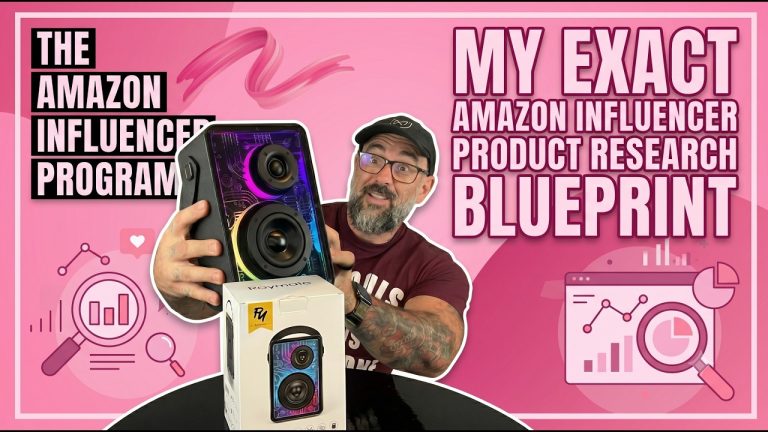
I walk through this with real thumbnails from my own Amazon storefront because theory only goes so far. When you line them up, the pattern is obvious: the thumbnails that perform are the ones where the product is unmistakable at a glance. No squinting, no decoding. The ones that underperform are usually the ones where I got cute — too much going on, the product shrunk into a corner to make room for “design.” Looking at your own carousel honestly is the fastest way to see this for yourself.
Where Text and Arrows Should (and Shouldn’t) Go
I’m not saying text and arrows are banned. I’m saying they have a place, and that place is never the center. The center of your thumbnail belongs to the product, full stop. If you’re going to add a small callout or an arrow pointing to a feature, push it to an edge or a corner where it supports the image instead of fighting it. The moment text covers the product, you’ve defeated the purpose. Think of any graphic element as a quiet helper, not the headline.
Show Results, Not Just the Product
There’s a level above just showing the product cleanly, and it’s showing the result the product delivers. A shopper isn’t really buying the object — they’re buying the outcome. If your thumbnail can show the product mid-use or show the after state, you’re answering the shopper’s real question before they even click. The product is the star, but the result is the reason they buy. When you can communicate both in one frame, that thumbnail is going to outperform a plain product shot every time.
The Core Rule Behind Every Great Thumbnail
If you forget everything else, keep this: clarity beats cleverness. Every decision — what to show, where to put text, how much design to add — runs through one filter. Does this make the product instantly clearer to a scrolling shopper, or does it just make the thumbnail busier? If it adds clarity, keep it. If it adds noise, cut it. Great thumbnails aren’t the most decorated ones. They’re the ones that win the click in the half-second a shopper gives them.
How Oink’s Thumbnail Templates Work
Knowing the rules is one thing — producing on-brand thumbnails fast, video after video, is another. That’s why I built thumbnail templates right into Oink for Influencers. They’re designed around exactly these principles: product as the star, clean composition, callouts kept to the edges. Instead of fighting a design tool for twenty minutes per video, you drop your shot into a template and have a high-converting custom thumbnail in seconds. It removes the excuse to ever let Amazon auto-pick again.
Why This All Matters for Your Commissions
Zoom out and the stakes are simple. You can have the best review video in the carousel, but if your thumbnail doesn’t win the click, nobody ever sees it. Thumbnails are top-of-funnel for everything you do in the Amazon Influencer Program. Fix them and you lift every video you’ve ever posted at once. It’s one of the highest-leverage changes you can make this week, and it costs you nothing but a little intention.
If you want to stop letting the algorithm pick your thumbnails and start cranking out pro, on-brand frames in seconds, the thumbnail templates I show in this video are part of Oink Pro. Oink is the all-in-one Chrome extension built for Amazon Influencers — find great products, build thumbnails fast, track commissions, and skip the busywork. Get it at oinkforinfluencers.com and take control of the frame that’s winning or losing your clicks.